June 30, 2009

Judít García-Talavera: Barcelona Illustrator.


In the last two days, I have started to get nostalgic of my time in Spain last year. I actually started looking through my old blog posts and admiring the beauty of the country I called home for about 3 months, from August to November. I have a coworker who is there right now and two friends who will be going later in the summer. When asked about it, I am more than overjoyed to give them my two cents of the places to see and what to do – though for me, the best part of my trip was the unscripted travels and personal exploration.

Anyhow, it seems I must have been predisposed to discover a wonderful illustrator this morning who resides (surprise, surprise) in Barcelona. Judít García-Talavera has been commissioned for work by many Spanish magazines such as Marie Claire, Rolling Stone, and Papier Doll. Her work has great pops and splashes of watercolor on heavily textured paper while using fabulous negative space too. Get in the Spanish state-of-mind and check more of it out here.

June 29, 2009

Camper Shoes.


To be honest, I didn't know much about Camper shoes branding before but after discovering some fun layouts via the Barcelona-based design studio, Ruiz+Company, I grew intrigued and checked out their website. It was full of fun interactive pieces like this watering can that asks viewers to think about WHO would the shoes imagine wearing THEM?

June 26, 2009

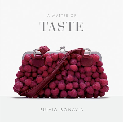
Fulvio Bonavia: Food & Fashion


Again, another photographer crush I discovered though this one is specifically around this conceptual work by Fulvio Bonavia. I just might have to check out this entire book to see what else was cleverly put together. Food meets fashion here in this fantastic collection. I mean spaghetti as a belt? Cashews & almonds for shoe straps? Delicious art indeed! I guess if one were to be shopping all day and got hungry, then perhaps a nibble on one's handbag wouldn't seem that out of the question, right?

June 25, 2009

Michael Wirth: Photographer.


Since attending the LeBook Connections last week I can't stop looking through all of the gorgeous photo samples we received from all of the reps. They sit a mere 18 inches from my keyboard and stare at me, wanting me to pick them up and take a gander and totally lose all thought in them and take me away from any real work I might have to do. The way I look at it now? This IS doing work. These photographers are so inspiring. The work they do that represents themselves as artists is something that I strive for.

This leads me to show you some ads that were shot by photographer Michael Wirth (repped by Stockland Martel) for Clarins. Love the typography AND of course, the photos behind the words – one happy marriage of visuals on a magazine spread!

June 24, 2009

Regina Spektor: Far.


Ahhh, the time has come! My favorite female singer-songwriter, Regina Spektor, just released her newest album, Far, yesterday! I am listening to a stream of the entire album via NPR (a bit of a taste of it until I hit up the music store and buy it...yes, I still buy CDs) and just also watched the first video for the album for the song "Laughing". It did not disappoint and was classic, artsy Regina with smart lyrics and some cool illustrations. Check out the screen captures above and the video here.


June 23, 2009

3 Screams for Ice Creams.


Perhaps it's the gloomy weather we have been having or perhaps it's the fact that I was in my hometown last weekend that has me thinking more about ice cream right now. Having worked in an ice cream shop in my hometown for 4 years makes one think they are something of an ice cream connossier, which I do think I am. I have my favorite flavors (notice I said "flavors" not "flavor" as I could never limit myself to calling just ONE my one and only) that range from banana or maple walnut or coffee to dulce de leche or cinnamon. I'm not a big toppings fan though rainbow jimmies (or "sprinkles" as the rest of the country aside from New England likes to call those slightly crunchy and sweet) get me everytime if they are the "good" ones. In honor of the official start to summer being this past weekend, I am calling out three local ice cream shops that are on my "to try" lists for not only their taste but ALSO their wonderful and non-boring logos! L'Arte del Gelato in the West Village of Manhattan, Blue Marble Ice Cream in Brooklyn and Van Leeuwen who sells their ice cream to local shops as well as has an ice cream truck (that is one of the prettiest I have ever seen and looks similiar to the illustration on their website) that sits outside of my local video store.

June 22, 2009

Brooklyn Fare.


After seeing the new package design and super smart copy written for the latest foodie shop/restaurant/school/caterer in Brooklyn, I knew I had to check them out more online. Upon doing so, I was met with an equally well-designed website and smart headlines. I can't wait to check Brooklyn Fare out in person – and sample their wares, of course.

This was the packaging showcase, designed by one of my favorite places Mucca Design, that got me hooked (thank you, Dieline!):


June 18, 2009

Martín Sigal.


Yesterday afternoon I was fortunate enough to go to LeBook Connections event here in NYC. It is one big playground for creatives with photographer reps, illustrator reps, magazines, and some design and advertising studios. My jaw was dropped for nearly every book that I flipped through – great photography just does that to me. I left with a LONG wish-list of photographers that I would love to be able to work with on future projects, may those opportunities arrise. One photographer in particular whose work I absolutely adored was Argentinian artist, Martín Sigal (repped by Stockland Martel). His colors are raw, the lighting is perfect, the energy fantastic and composition brilliant. Some samples of his work are above. For more, check out his website.

June 17, 2009

Typeface Tees.


I have reached new levels of typography geekdom. I can't help it. It is an uncurable malady that I actually don't WANT to be cured of. Does this sound nuts or familiar to you? If it's familiar, then I know you will love this series of t-shirts designed by Camdon Wilde. He had me at hello with his Period Table of Typefaces (thank you SO much each penny pretty for the recommend) and then again, with these shirts. My biggest problem? Which font do I want to wear?!

June 16, 2009

Khaki + Gap = Fashion Surprise.


Today is the first day of the new Gap Khaki launch with designers (and winners of the 2008 CFDA Vogue fashion awards) Alexander Wang and Vena Cava. The ads are pretty awesome (I just spied my first look at them in the Sunday Times this weekend) and definitely do what Gap used to be known for doing – clean, happy, ads. These were shot by photographer Craig McDean. I myself am not a huge khaki fan but might have to satisfy my curiosity and head into the Fifth Avenue Gap today to see what the hype is all about.

June 15, 2009

Stina Pearson + Face Boutique.


I saw these products on The Dieline and was immediately taken with them AND immediately knew they were the handiwork of one of my favorite illustrators, Stina Persson! Face Boutique is a natural skincare brand for teens and twenty-somethings.

June 12, 2009

Absolut No Label.


I've always thought that Absolut has done a killer job in the advertising and design department; always fresh, always clever, never obvious. This latest bottle design, Absolut No Label, is a perfect testimony of how a brand that has built it's reputation on a simple but clean structure design can outwit any marketing manager who says "Make the logo bigger, please". There is no logo, no name, nada. Just the bottle. They are in limited edition and are numbered.

Yet Another Reason to Buy the iPhone.


(If only they would partner with Verizon). But seriously, how cool is this app for the iPhone? Take a picture of something with a fabulous color that you like and via Sherwin Williams or Benjamin Moore (whichever app you choose to use) a paint chip with that matching color appears! Incredible!

Found via Design*Sponge

June 11, 2009

An Abstract Alphabet.


I stopped into Kate's Paperie this morning to peruse and be inspired (plus, I just love to touch all of the paper). In the front window there was a lampshade made up of typography as well as a book of the alphabet – done in artsy way of course – that I loved and told myself I would remember the name of the author to look it up on Amazon. Honestly, I don't know why I don't write more of these things done because of course I got on the subway, rode up to midtown and forgot the author's name. Anyhow, in my search I came upon THIS book which turns the alphabet into abstract art (or abstract art into the alphabet), A is for Art: An Abstract Alphabet by Stephen T. Johnson. I kind of love it and kind of want to add it to my ever-growing wishlist of design/typography/photography books. When I find the original book I was looking for, I will post about that one too. Though that might take another trip to Soho and back to Kate's to refresh my memory...

Game...Set...Match...Pentagram!


Yet again the super smart designers at Pentagram find a way to turn something around and make it clever, beautiful and make other design geeks say, "wow, I wish I worked on that". They have redesigned Tennis Magazine and made it nice and clean. I actually want to pick it up and read. The covers have a new font family, a wonderful pop of color for the majority of the backgrounds, and photography full of energy.