May 29, 2009

Kleenex + Target = A Bite of Summer.


Oohing and aahing and "you HAVE to see this!" just ensued over at my desk when I saw these new Kleenex boxes designed specially for Target (seen via the Dieline). LA-based illustrator, Hiroko Sanders worked on them as well as the in-house design team at Kimberly Clark. Tell me these wouldn't soften the blow (no pun intended) of having summer allergies?

May 28, 2009

Even NY State Senate Needs a Creative!

Christopher Sealey, newly appointed Creative Director of the NY State Senate (photo from NY Magazine)

I love stories about creatives found in unlikely places. It just goes to prove the point that my professors were always making in college – design is everywhere. AND, more importantly, it is NEEDED everywhere! Where is one of the last places you might find a creative director? At the New York State Senate in Albany? Good guess, you're right! They just hired a design pro, Christopher Sealey, to help them brand the Senate through design, photography and multimedia.

Go designers, go!

May 27, 2009

A Funny Way to File.


Even though I am a graphic designer and love making everything line up and look perfect and straight, I sometimes have issues when it comes to personal organization. I have a four-drawer Bisley that I love and which holds almost all of my art and design supplies; as well as stray papers, bills, mail, receipts, etc. I hate this about myself! Why can't I file? Just sitting below Bisley is Matt's filing cabinet where HE has no problems putting documents in appropriately named files (or at least it appears that way).

Well, I just found these funny files and these that I think might help me a little bit. What a way to turn something as mundane as filing and turn it into a joke? Kind of love it.

May 26, 2009

Metromint.


I know, I know, you are tired of seeing more water packaging. What else can people add or subtract from their water to really make it that much different? Well, this packaging for Metromint stopped my at Whole Foods this weekend – I am pretty sure it was the shiny silver paper that made me pick it up and want to touch it. Goodness, I am such a predictable graphic designing consumer. It really was worth the pick up though! I also liked the packaging and message concept which is "six degrees of cool hydration"; all waters with different levels of "cool factor". Though I like mint in my gum, in my spearmint leaves candy (those kelly green leaf-shaped gummy things covered in sugar crystals...those are PURE Maine memories) and with my chocolate chips (for ice cream, of course), other than that, I am not a huge mint-loving person. Ergo, I didn't buy a bottle of this water but still liked the concept and the design. If you ARE a fan of mint water and want to try it out, they have a Word of Mouth program where you can get free waters!

May 22, 2009

People's Peepers.


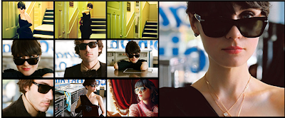
Really liking the clean (and HUGE perfectly clear images of the glasses) website design for Oliver Peoples. And especially the flash intro which combines sunglasses featured on Zooey Deschanel in the short, Catch a Tuesday.

May 21, 2009

Gattefossé: Some Clean Packaging Machines.


This packaging system I saw on the Lovely Package the other day really caught my eye. A simple graphic solution with a GREAT use of two-color printing.

May 20, 2009

The Greening of NYC.

Broadway in Times Square now (left) and coming soon (right)

Broadway in Madison Square now (left) and coming soon (right)


This woman is amazing! She is greenifying, de-car-ifying and bike-adding our very loud, very car-filled, very bus exhaust fumed city little by little. She is a strong transportation pioneer! Next time you walk through Times Square things will be VERY different (starting this weekend and supposedly finishing by the fall!)...

May 19, 2009

Tangled Alphabets.


Tangled Alphabets is the title of a newish exhibit that is going on at the MOMA right now until mid-June and one that I must go see. The poster has caught my eye more than once as I am hurriedly moved up the subway stairs like sheep in the mornings at the oh so crazy midtown subway stop I am oh so fortunate to work near. Well, I am fortunate in the sense that I see this poster right?

Anything having to do with alphabets and hand-written type is sure to catch my eye. So this new exhibit title was an easy sell for me and I went to the website here and learned a bit more about the two artists whose works make up Tangled Alphabets. It is now on my list of "museums I need to go to before this exhibit closes."

May 18, 2009

I Need a Book. And I Need Inspiration.


Recently I have found myself with growing lists (Post-its and otherwise) and ideas of things I really want to do design-wise. It seems a bit overwhelming even when I break it down piece by piece in my lists (the best way to actual get things done...teeny tiny pieces) but then I don't feel like doing anything on those lists when I come home at night after spending 8 hours staring at my Mac at my job. How to motivate?! These two books might be helpful. The first one, Craft, Inc: Turn Your Creative Hobby Into a Business is one that has been on my MUST READ list since it came out and hit the design blogs. The second, The Design Entrepreneur: Turning Graphic Design Into Goods That Sell, I just read about from Felt & Wire this morning. Since I have been without a book to read since finishing (over two months ago) a fantastic memoir of a waitress at Per Se, Service Included, I am in desperate need of something. My reading since has consisted of New York Magazine and the New York Times. With a 25 minute subway ride each way, that is quality reading time 10 times a week!

May 15, 2009

Where Advertising is Going.


Interesting article in the NY Times this morning about more ads talking to the consumer during the recession; less of being like a friend and more of "we feel you, we're there too". Of all of the examples they gave, JetBlue is my favorite. Then again, I love pretty much everything JetBlue does.

Hi Hair.


Working at a beauty company (specifically with haircare) I am always on the lookout for innovative ways to design for hair. If you think about it, hair is hair. What more can you do or show in your advertisement or in your product design or on your promotionals? Well, this company, WomanHairStyle, I saw (via the Dieline) has taken it to the next level. Hand-drawn illustration of flowing and waved hair down in simple two-color. Above is the bag and then below is an ad.

May 14, 2009

All Mine.


Just read this post from the Scoop and I had to go on and see what it was all about. Amazing concept that makes me want to sign up (which I just did about 3 minutes ago) but at the same time makes me fear for magazines published everywhere. If the public can one day totally customize, then why will we need individual magazines? That's not my personal opinion, but when I think some publishers might think. I love magazines like I love books; I love holding them, flipping through their pages, watching them pile up in our living room (okay, Matt may not like that part) or lining them up in our bookshelves and going back to them for ideas and inspiration later on.

The idea is that you get to pick from these 8 magazines (that I have shown above) and answer 5 quick questions, fill in your name, address, and birthdate and within two weeks you will get one of 5 free issues of Mine, your customized magazine. It is currently being produced by Time Magazine and sponsored also by Lexus (they might think that by sponsoring my new magazine that I might want to buy one of their cars; little do they know I live in Brooklyn and take public transit). It takes selected articles from current issues and combines them into one just for you – with section separators (a page which says the name of the magazine that those articles that follow will be from) and a table of contents too! Pretty incredible, huh? I picked Real Simple, InStyle, Travel + Leisure, Food & Wine, and Money. We'll see what happens!

JHill Design & Places in Patterns.


I've seen her work many times before (thanks to my trustworthy daily design blogs I read) but forgot how much I loved it! JHill Design is a VERY talented woman who I recently learned used to work for one of my favorite beauty companies, Fresh. Her fondness of pattern and typography totally won me over the very first time I saw her designs and still looking through her website just makes me ooh and aah. I remember this series of her "Places I Have Never Been" being part of a calendar but I just checked out her site and she has actual prints of those places. Beautiful patterns that grasp a hint of that particular city envelop the page and then the typographic solution of the city name at the bottom; followed by random facts about that city and exactly how many miles (from Boston, as that's where she lives) it would take to get there. So wonderful and clever!

May 13, 2009

Austin on the Water.


Kayaking in Austin on the Colorado River. Aside from the crazy, strong wind we had against us going back up the river after some leisurely paddling/drifting down river it was fantastic. There were turtle sightings and some beautiful houses to see up in the trees and just fresh air!

True Texas.


Of all of the photos I took, I thought these represented Texas the best. Top left photo is the sawing demonstration at the Brew-B-Que. Bottom left is from a dirplay at the HatBox, a most perfect Texan hat shop (and where Matt and I found some great straw cowboy hats). Right photo is of the entrance to The Salt Lick BBQ 25 minutes outside of Austin. The sun was setting, the live music was flowing, and the smell of BBQ meats permeated the air.

Hey Cupcake!


Who says restaurant/food branding has to end when there are no real walls? I hope no one does because the mobile food "trucks" down in Austin on South Congress have another idea in mind. This one, Hey Cupcake, in particular caught my eye with their pink typography bouncing off the metallic silver trailer. That and the enormous cupcake rotating on the roof didn't hurt either. Small attention to detail was paid to the napkin holders and even the license plate.

May 12, 2009

Because I Can't Ever Seem to Get Enough Ketchup.


How great is this new Heinz ketchup ad I saw in Martha Stewart Living this month?

Ketchup, I love thee. I love thee on grilled cheese, on french fries, on turkey burgers, on (the occasional) hot dog, on pasta (don't freak out, all you Italian Grandmas out there), on eggs, on home fries. You get the picture. Kathy, Caitlin and I used to go to brunch back in our early/mid-20s the Sunday mornings after a long night of beveraging only to half-devour the once-full bottle of ketchup that was on the diner's table. Kathy would watch in horror as Caitlin and I would pass the bottle back and forth and empty it's red contents little by little on our plates of eggs and potatoes. All for the love of lycopene, I used to say!

Of course this ketchup use has subsided a little as I don't do the post-partying brunch as much as I used to, but that bottle of Heinz is still readily available in our fridge at home and is utilized at any moment that might call for tomato goodness.

May 11, 2009

Elum Design.


Letterpress is something that I have really always been fond of. I love the way it looks and feels; so EXTRA glamorous and just, well, nice! I really want to know how to do it and have been pondering taking a class. Until then, I will continue to ooh and ahh at pretty designs made prettier by their letterpress technique. One such designer I ogled this weekend in Austin is named Elum Designs (images above) which I found at this most fabulous home/design/artifacts shop called Mercury. I couldn't stop wanting to touch the inset of the textured uncoated paper! Though don't worry Mercury, I didn't because it was behind the plastic wrapping.

Austin Rocked!

Suzanna Choffel – my new favorite singer; taken by phivephotography.com at the Brew-B-Que


This past weekend it was oh so fantastic to see my brother, explore a new city with Matt and really get to see what Austin, Texas was all about. Lots of photos were taken – inspiration abounded through my camera lens. It is quite amazing that when I leave NYC and head somewhere new, my shutter finger can't stop taking in the delight of the new, different and sometimes common beauty that resides in other cities that have become wallpaper in my own. Austin was no different though there were lots of uncommon beauty there too, including the sunburn that I achieved from one full day outdoors involving kayaking down the Colorado River and playing Pitch 'n Putt in 95-degree sun.

I, of course, don't have photos yet uploaded but wanted to share a fabulous new singer that I saw perform on Saturday afternoon at Austin's first annual Brew-B-Que (yes, it was everything you could imagine something with that name might be – beer, barbeque, live music, live sawing demonstrations, log rolling, chihuahua races, beer pong competitions, barbeque competitions, and of course, lots of sun). Her name is Suzanna Choffel and I am on the hunt for her music online (of which I found her MySpace page with 5 full song tracks as well as through iTunes Music Store). My goal is actually an actual CD that I can hold in my hand, purchased at the Virgin store in Union Square. I know, I might be one of the only people you know who still likes to buy non-digital music. There is something still wonderful about opening up that plastic case and digging into the booklet tucked inside the front cover of the CD case that I love. Anyhow, I recommend you take a listen to her and be on the lookout for more Austin posts to come!

May 7, 2009

Typography Underground.


Okay, so here is one more post before I leave (clearly this cold has gotten to my head). This posting is all about typography down below the street; in the subway system!

On Sunday it was raining cats and dogs all day and Matt was itching to get out of the apartment and do something so we took ourselves and our umbrellas and made our way to downtown Brooklyn for a little field trip – to the New York City Transit Museum. This is actually a place I have wanted to visit (as geeky as that sounds) but just never got around to and to be honest, I had always thought it was in the city, not Brooklyn. Anyhow, we arrived and wouldn't you know, the entrance actually LOOKS like you are going into the subway; as it turns out, the location of the museum used to be a real station. It was an interesting look into the history of the building of the subway in the early 1900s as well as the bridges that connect the boroughs of NYC. There were some fun things to play with and learn also about the history of the actual turnstiles where they had all of them from the very first to the current one used that you could "go through" to see the difference in the weights of the materials used. They had old subway train cars that were actually ON the tracks to walk around in (I loved seeing the old advertisements that lined the cars. For some reason, I thought subway ads were a newer thing of the past couple decades). There were some other interesting things to see and touch and walk through and I recommend adding it to your list of "to dos" next time you need a rainy day activity.

Of course through all of this, I noticed the typography used and the old signage of which there were many samples. Above is just a small selection of those I photographed.

May 6, 2009

If Only I Could Breathe Through Both Nostrils...


...I would be able to smell these delicious flowers I saw at the Brooklyn Botanical Garden at this time last year. Unfortunately I can't and am about to get on an airplane in the morning; perhaps the last place one wants to be when they have a cold. Alas, all in the name of going south to soak up the sun, the BBQ, the Tex-Mex, and the great outdoors in Austin. Have a great rest of the week and weekend and I'll be back on Monday!

May 5, 2009

Sarasota Selects.

Clockwise from left: sticker on the pack of a truck in the marina parking lot, view off the boat as we were leaving port, the bait of the day, my fishing rod ready-to-go (which, unfortunately, caught nothing but the hook of another fisher on our boat – twice – seriously, I'm not kidding)

An incredibly large statue of the "nurse and sailor" at the marina. Seriously large, like bigger than the palm trees big, if you can't tell.


Lunch at the crab shack! I wish I could remember the name of the restuarant...but this is the view off the back deck (on the right).

Great collection of old Polish circus/art posters, called CYRK, at the Ringling Art Museum

The mini circus: people in their seats, people buying tickets and going into the sideshow, the best part of the show – the trapeze artists!


I know I was in Sarasota, Florida over a month ago but I finally got around to color-correcting and uploading them ALL as of last night. We did an assortment of activities including a fishing boat trip (on pretty rough Gulf waves that almost had both of us sick but did end up with Matt catching 3 lil' fish), a trip to the art museum to see a crazy awesome exhibit on the circus (including a perfect scale model of the circus and all of its tents and cars; put together over a span of 50 years!), a drive down Lido Key for some stone crab at a laid back crab shack on the bay, and all in all just having a nice, warm time down south with my amazing Grandparents.

Next trip: Austin, Texas this weekend! Live music capital of the world and the home of my brother. We can't wait and hope to have some fun photos to share (a lot sooner than these FL ones) of some BBQ and great outdoors. What will two city dwellers like Matt and I do? My friend Audra warns me that I won't want to come back home to Brooklyn. We will see...